Tumblr introduces fresh web interface bearing a striking resemblance to the design of X
Tumblr's new web design, resembling X (formerly Twitter), seeks user-friendliness but divides its community and faces financial concerns.
Highlights
- Tumblr adopts a new web look akin to X (previously Twitter), prioritising user-friendly navigation and layout adjustments
- The change garners both positive and negative reactions from the existing Tumblr community, reflecting the challenge of balancing innovation with user preferences
- Amidst the redesign, Tumblr faces financial difficulties, with an annual deficit, spotlighting the platform's efforts to evolve and remain sustainable
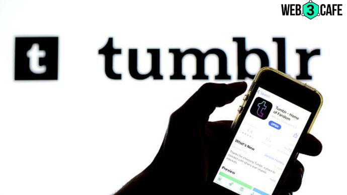
In a bid to enhance user experience and accessibility, Tumblr has officially launched an updated web interface, following a month-long trial period with select users. The revamped navigation layout bears a resemblance to X, previously known as Twitter, featuring a left-aligned navigation bar and relocating the compose button to the bottom left corner—akin to X's design.
User-centric evolution: Enhancing accessibility & engagement
Acknowledging the need for user-friendly design, Tumblr explained that the overhaul aimed to simplify navigation for both newcomers and existing users. The company highlighted its strategic shift from a button-centric approach to a text-label inclusive design, spurred by user feedback during the testing phase.
This change, in contrast to previous endeavours, encourages users to explore different corners of the platform, contributing to a more intuitive and satisfying experience.
Adapting & refining: Feedback-driven improvements
Incorporating valuable insights gained from user engagement, Tumblr has fine-tuned the new interface to align better with user expectations. Notable adjustments include repositioning settings subpages to the right of the settings page, rectifying issues with messaging windows on smaller screens and streamlining the Account section for smoother navigation to user blogs.
Furthermore, Tumblr is actively exploring a collapsible navigation option and optimising screen space utilisation for users with larger displays. The platform also has plans to enhance access to accounts and site blogs, demonstrating an ongoing commitment to user-centric design.
Strategic design evolution amidst shifting landscape
The updated interface follows a surge in Tumblr's user base following Elon Musk's influence on X (formerly Twitter) in the past year. This trend underscores Tumblr's status as an attractive alternative for users seeking a different social media experience. While the revamped design aims to cater to new users, it has generated mixed reactions from the existing Tumblr community, as evident from user expressions on X.
Financial landscape & cultural sensitivity
Notably, the interface overhaul comes shortly after Tumblr's CEO, Matt Mullenweg, revealed the company's financial challenges, with an annual deficit of around $30 million. This financial reality reflects the platform's journey from a billion-dollar Yahoo acquisition in 2013 to its subsequent acquisition by Automattic for $3 million in 2019.
While Tumblr's daily active user growth has faced hurdles post its explicit content ban, the platform's committed user base remains protective of its unique cultural identity, making any alterations a delicate balancing act. As Tumblr evolves its interface and navigates its financial landscape, it continues to tread the path of maintaining its identity while adapting to shifting user preferences and expectations.